
What is GitHub contribution graph art?
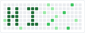
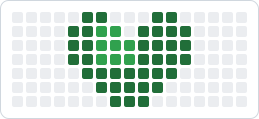
GitHub renders your public activity as a heatmap on your profile: one small square for every day of the year, shaded from light to dark green depending on how many contributions you made that day. Contribution graph art is the practice of deliberately shaping those shades so the overall grid forms something recognizable — your name, a heart, a pixel-art invader, or a rolling wave of steady green that signals consistency to anyone who visits your profile.
Because the graph is public and sits at the top of every profile, it has become a small canvas that developers use to express personality and showcase commitment. The key insight is simple: the graph is just a grid, and a grid can hold a picture. Once you understand how days map to cells, you can plan any pattern that fits inside 7 rows and roughly 52 columns.
How the grid maps to real dates
Every square is one calendar day. Understanding the layout is the difference between a crisp design and a smudge.
The graph has 7 rows, one per day of the week — Sunday at the top, Saturday at the bottom. A vertical line of green is a single week where you contributed every day.
Each column is one week, read left to right across roughly 52 weeks. Horizontal shapes stretch across time, so a wide design naturally takes longer to complete.
More contributions on a day mean a darker square. You can use this to add depth — light squares for outlines, dark squares for solid fills — turning a flat pattern into something with contrast.
Planning your design in a visual editor
Trying to map a picture onto dates in your head is where most attempts fall apart. A visual editor removes the guesswork: you paint directly on a grid that mirrors your real contribution graph, choosing which cells to fill and how dark to make them. What you see is exactly what your profile will look like once the plan is complete.
In the Graphex design studio you start with a blank canvas sized to your timeframe — one month for a quick word, or a full 52 weeks for an ambitious mural. You click cells to fill them, pick a color intensity, and the editor keeps everything aligned to real calendar weeks. When you are happy, you save the design and Graphex translates it into a day-by-day schedule of contributions to make.
From there the tool tracks your progress against the plan and reminds you when a scheduled day is coming up, so you never lose the thread of a long design. You can also start from a community template in the gallery and adapt it, which is the fastest way to learn how patterns are built.
It is technically possible to fabricate a contribution graph by scripting empty commits with backdated timestamps. We strongly discourage it. A graph built from hollow commits misrepresents your work, can violate the spirit of GitHub's terms, and ultimately fools no one who looks closer than the thumbnail.
The approach we advocate — and the only one Graphex supports — is to plan a pattern and then complete it with genuine contributions: features, bug fixes, tests, documentation, open-source reviews, and the daily work you were going to do anyway. The art becomes a byproduct of showing up consistently, which is a habit worth building on its own. Graphex never commits on your behalf and never backdates activity; it only helps you decide what to work on and when.
Ready to design your graph?
Sketch your pattern in the studio, get a day-by-day plan, and build it with real work. Free for individuals — no credit card required.
Related reading: Track and protect your GitHub streak · Contribution graph generators compared
Frequently asked questions
What is GitHub contribution graph art?
It is the practice of shaping the green squares on your GitHub profile into a recognizable pattern, word, or picture by making contributions on specific days. The graph is a 7-row grid of days, so with planning you can spell messages or draw simple pixel art across the weeks.
Does contribution graph art require faking commits?
No. The honest way is to schedule genuine work — real commits, reviews, issues, and documentation — to land on the days your design needs. Graphex is a planning and tracking tool: it never commits for you and never backdates anything.
How long does it take to complete a pattern?
It depends on the width of your design. A short word might take a few weeks, while a full-year mural spans all 52 columns. Because each column is one week, you can estimate the timeline directly from your plan.
Can I plan the whole year in advance?
Yes. A visual editor lets you lay out the entire 52-week canvas before you write a single line of code, so you always know which days need a contribution and how far along you are.